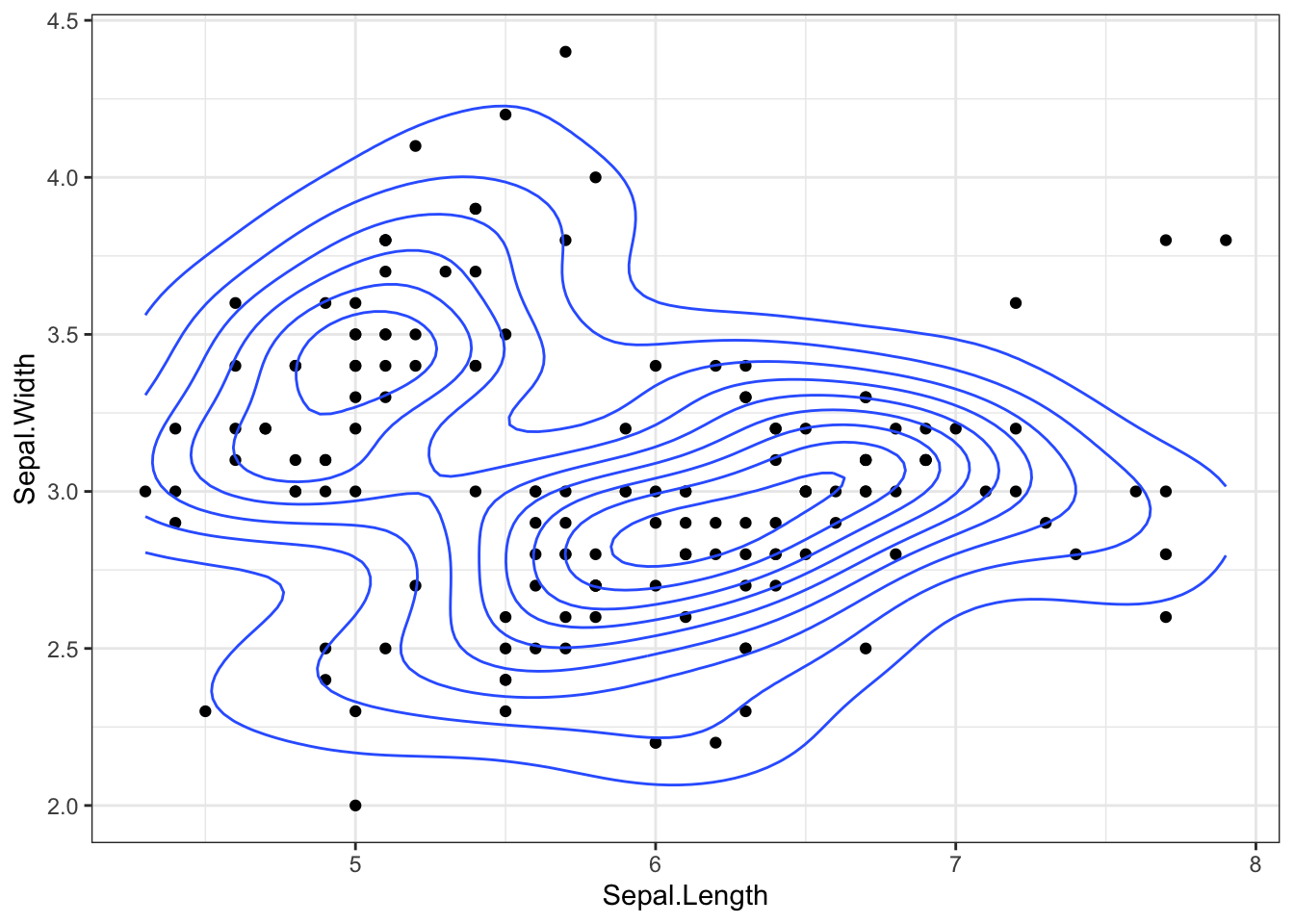
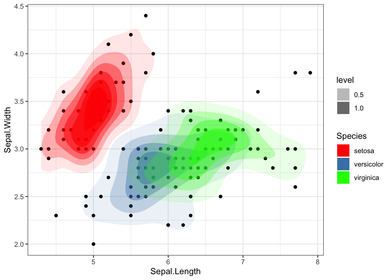
2d density plot is helpful for examining the connection between 2 numerical variables. It divides the plot area into several little fragments to prevent overlapping (as in the scatterplot next to it) and shows the number of points in each fragment.
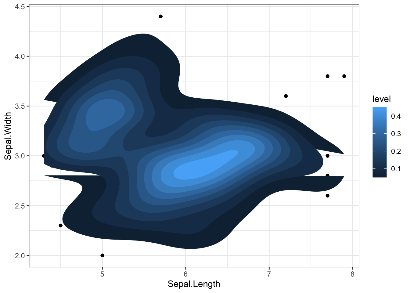
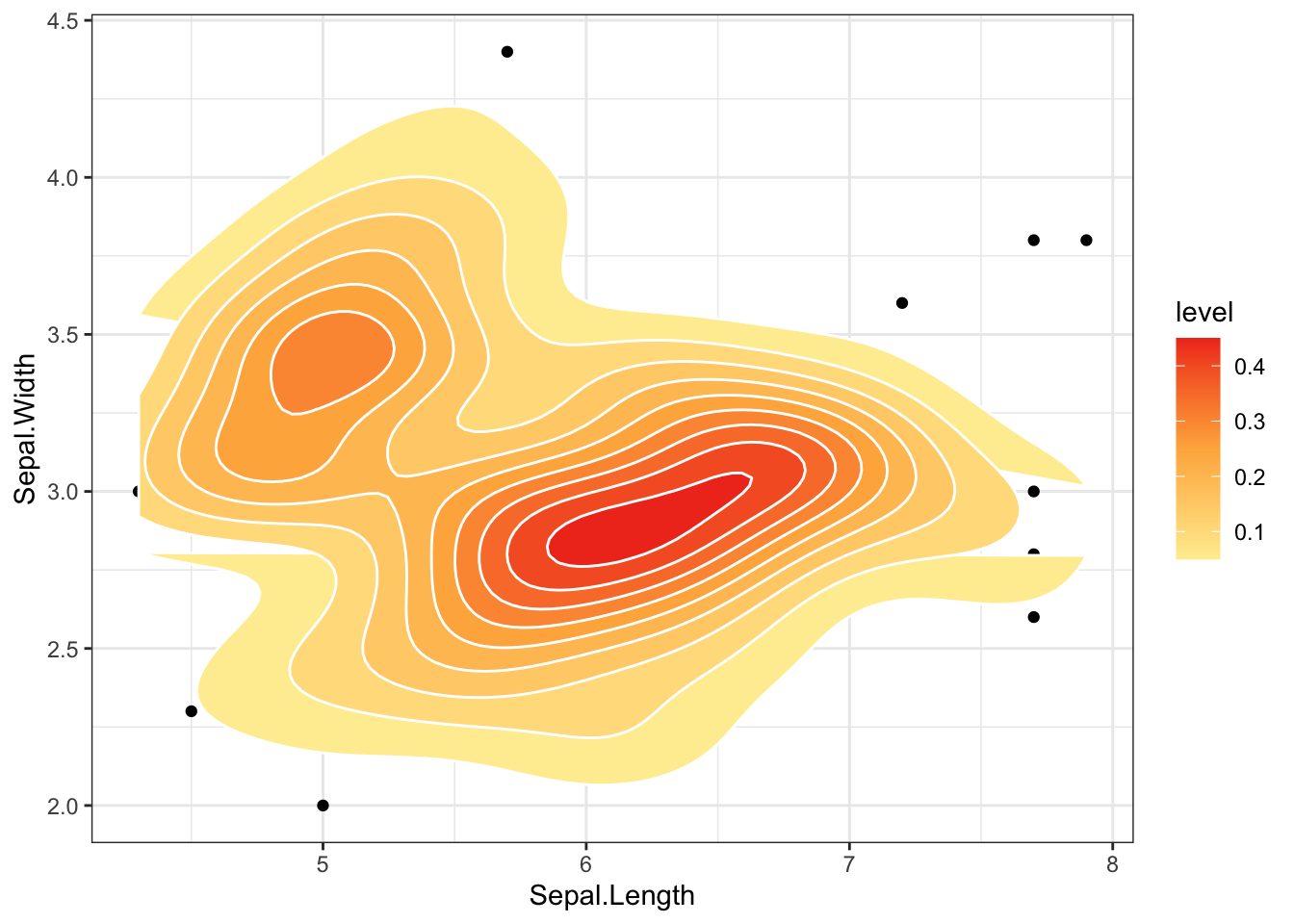
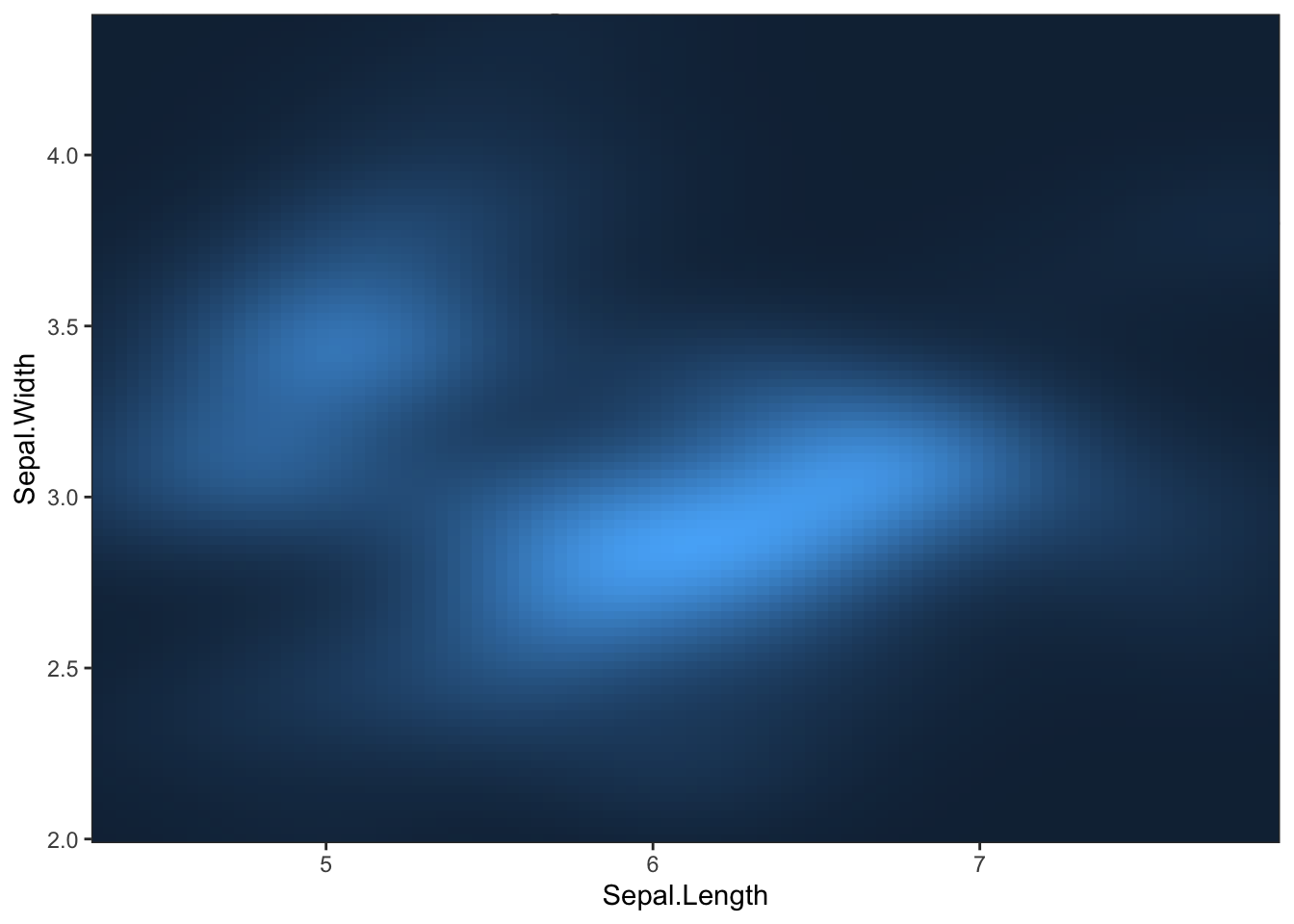
### Show the area only, with gradient colorsp+stat_density_2d(aes(fill =..level..), geom ="polygon")## Warning: The dot-dot notation (`..level..`) was deprecated in ggplot2 3.4.0.## ℹ Please use `after_stat(level)` instead.
### By adding to stat_density_2d the argument bins to avoid overplotting, ### control and draw the attention to a number of density areas in a very economical fashion.sp+stat_density_2d(aes(alpha =..level.., fill =Species), geom ="polygon", bins =4)+scale_fill_manual(values =c("red", "steelblue", "green"))
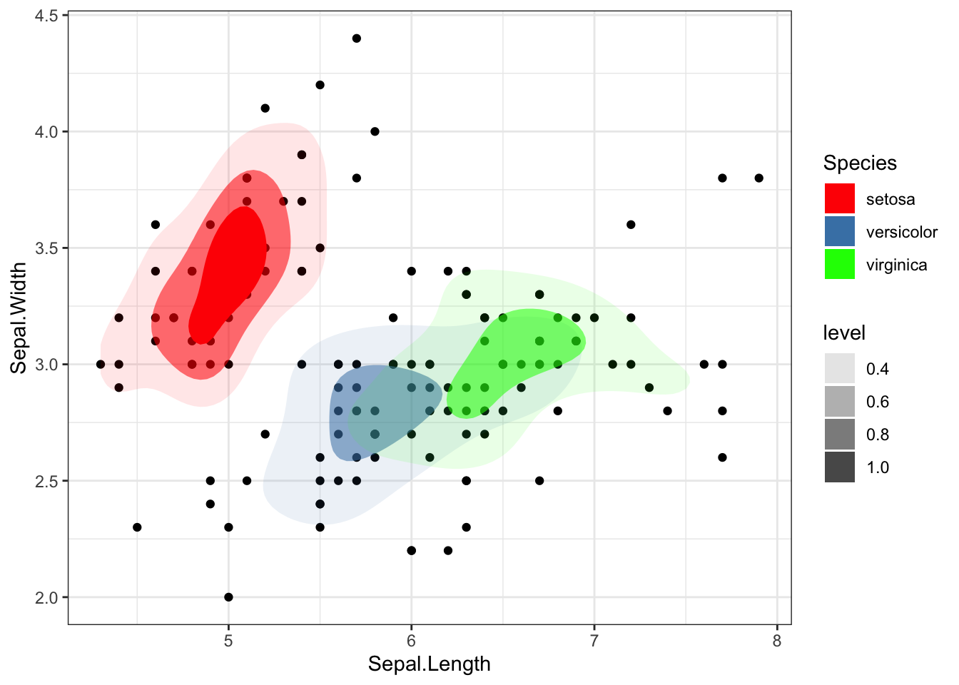
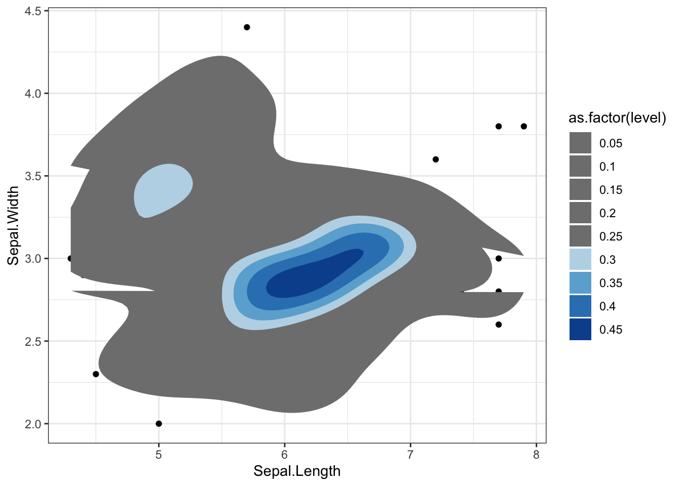
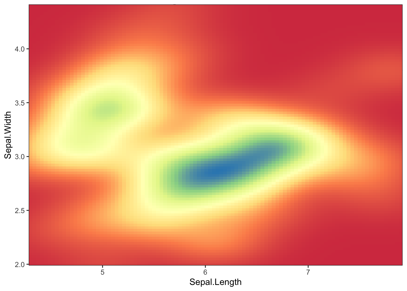
### Assigning manually the colours, NA for those levels we do not want to plot. Main disadvantage, we should know the number of levels and colours needed in advance (or compute them)sp+stat_density_2d(geom ="polygon", aes(fill =as.factor(..level..)))+scale_fill_manual( values =c(NA, NA, NA, NA, NA,"#BDD7E7", "#6BAED6", "#3182BD", "#08519C"))
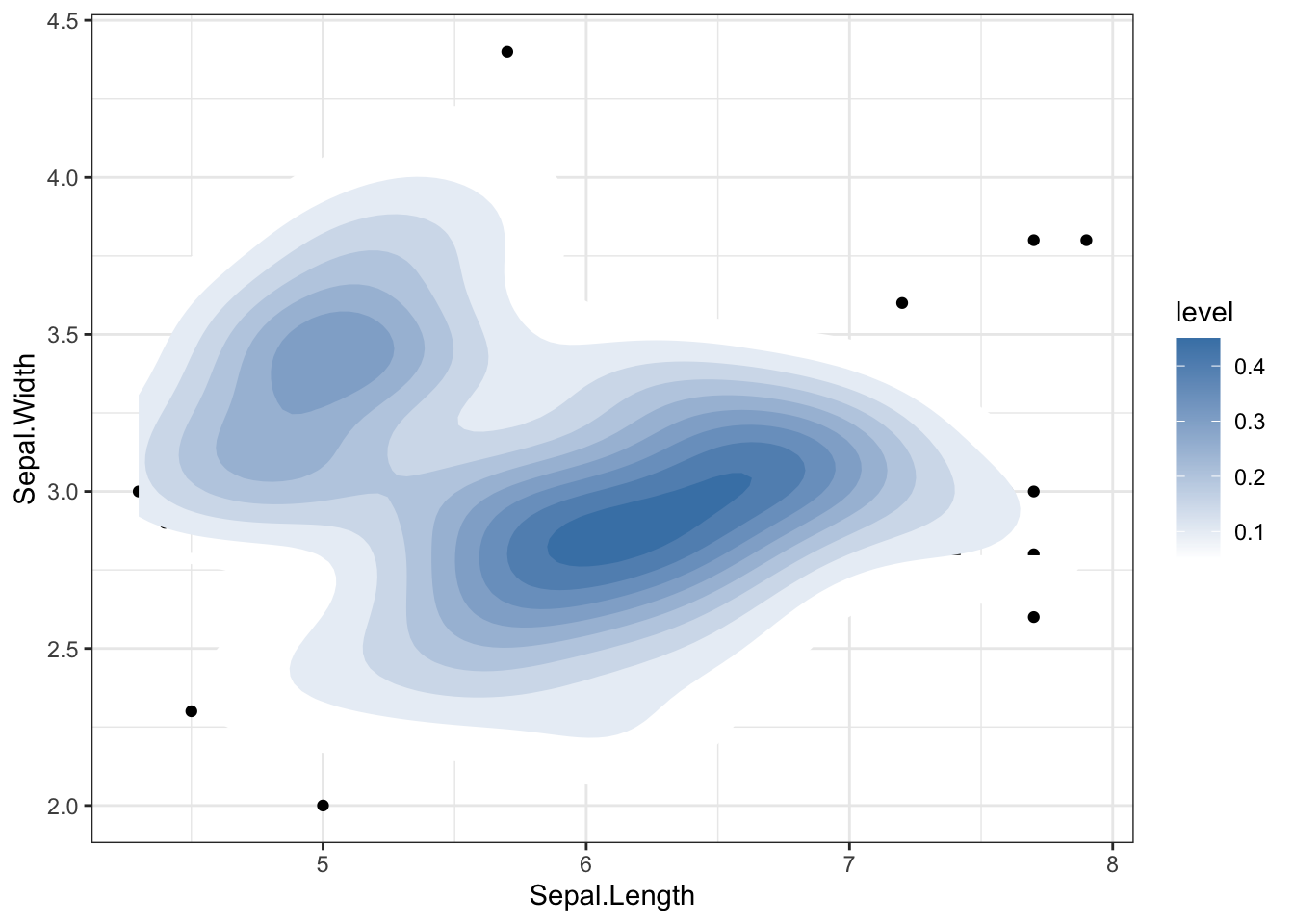
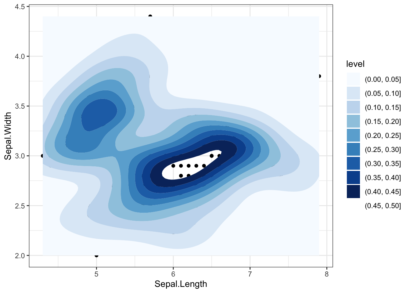
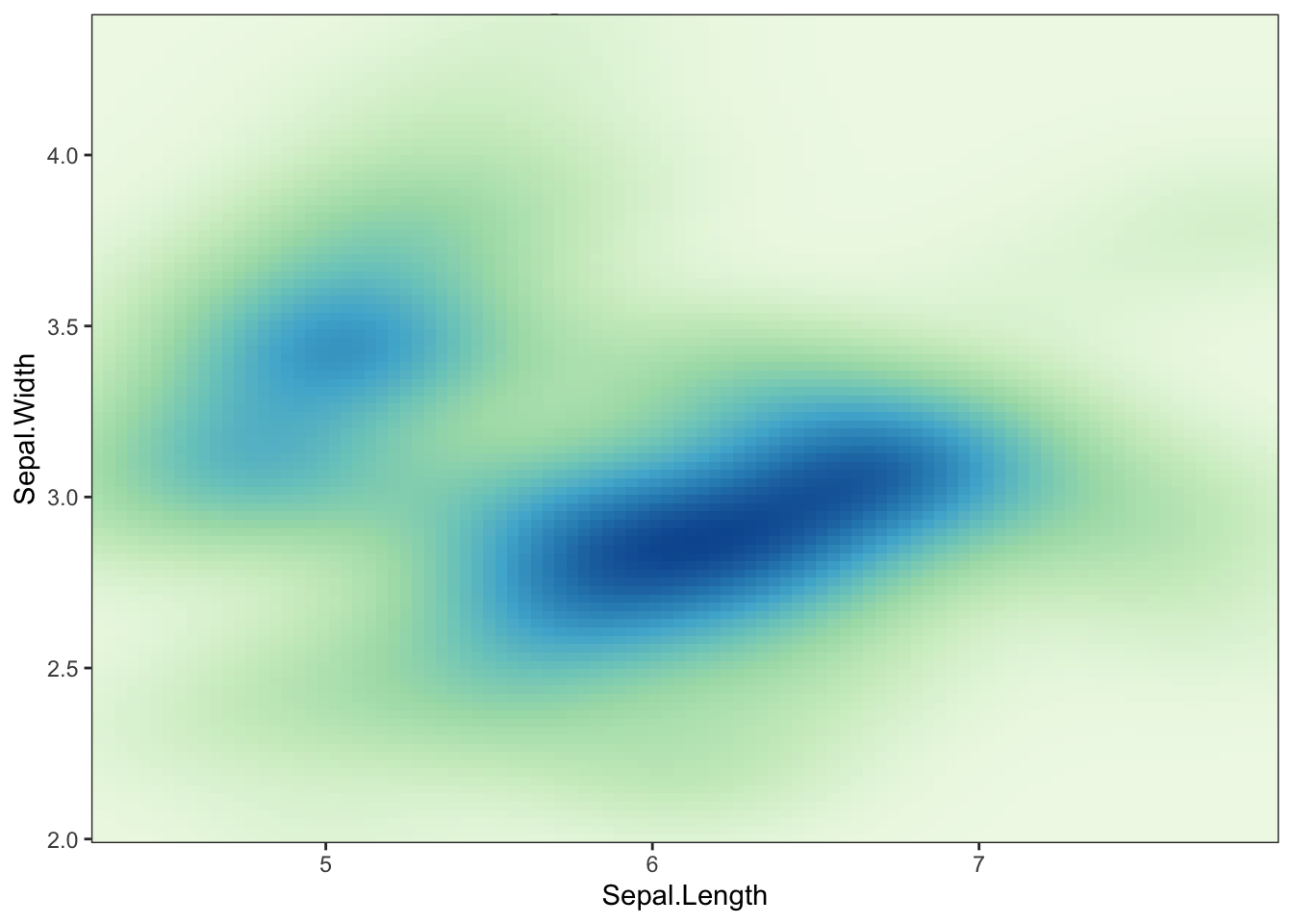
###sp+geom_density_2d_filled()+scale_fill_brewer()## Warning in RColorBrewer::brewer.pal(n, pal): n too large, allowed maximum for palette Blues is 9## Returning the palette you asked for with that many colors
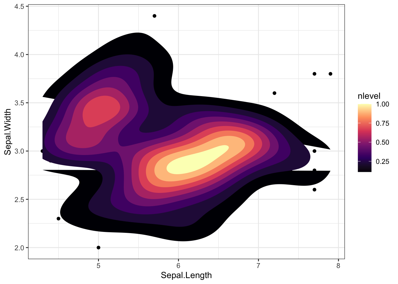
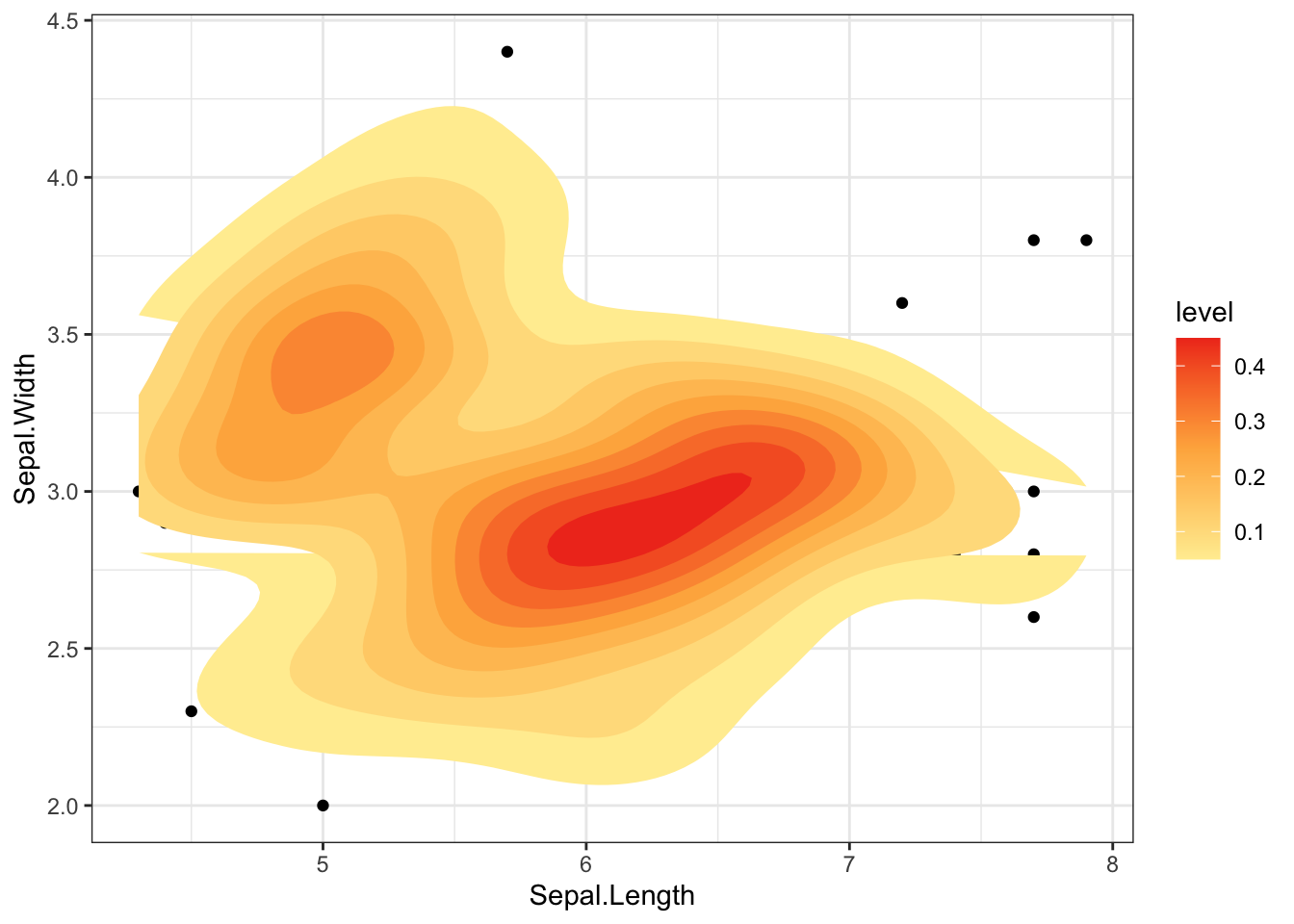
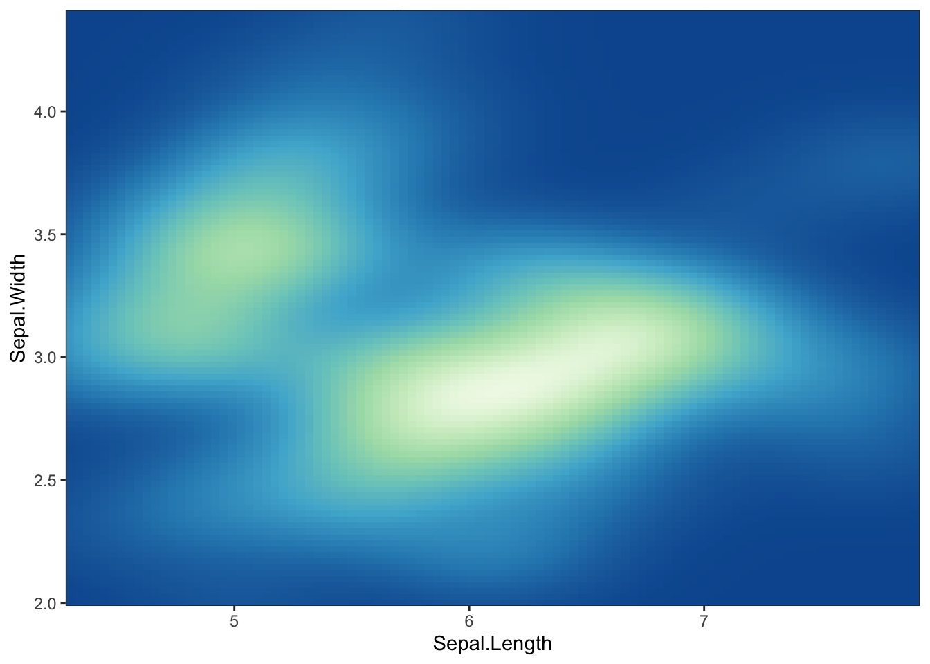
### Change the gradient color: RColorBrewer palettesp+stat_density_2d(aes(fill =..level..), geom ="polygon")+gradient_fill("YlOrRd")
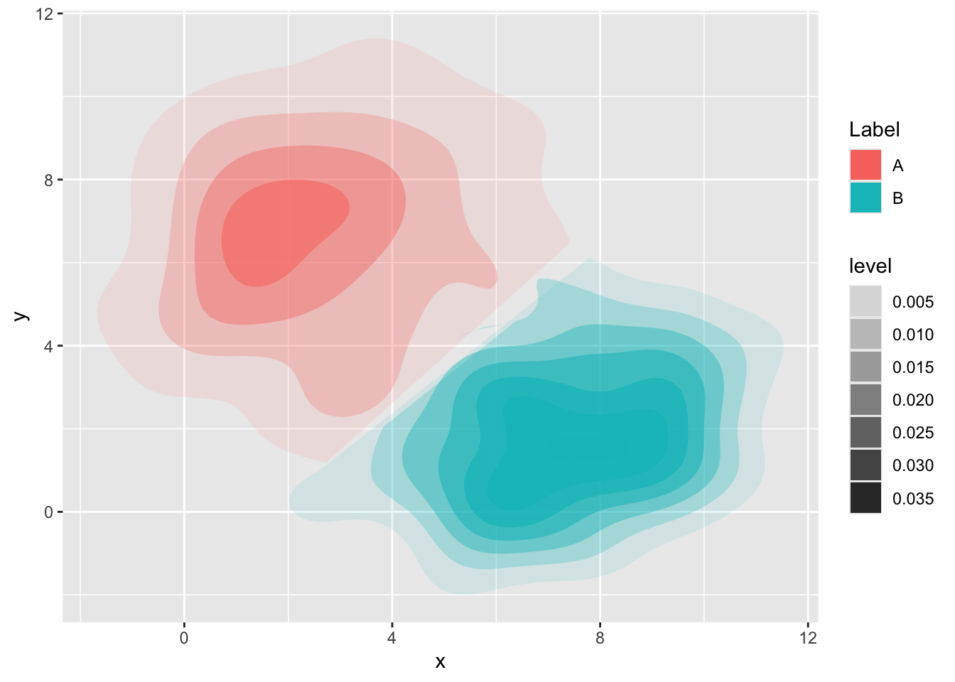
plot_data<-data.frame(X =c(rnorm(300, 3, 2.5), rnorm(150, 7, 2)), Y =c(rnorm(300, 6, 2.5), rnorm(150, 2, 2)), Label =c(rep('A', 300), rep('B', 150)))library(ggplot2)library(MASS)library(tidyr)#Calculate the rangexlim<-range(plot_data$X)ylim<-range(plot_data$Y)#Genrate the kernel density for each groupnewplot_data<-plot_data%>%group_by(Label)%>%do(Dens=kde2d(.$X, .$Y, n=100, lims=c(xlim,ylim)))#Transform the density in data.framenewplot_data%<>%do(Label=.$Label, V=expand.grid(.$Dens$x,.$Dens$y), Value=c(.$Dens$z))%>%do(data.frame(Label=.$Label,x=.$V$Var1, y=.$V$Var2, Value=.$Value))#Untidy data and chose the value for each point.#In this case chose the value of the label with highest value newplot_data%<>%spread(Label,value=Value)%>%mutate(Level =if_else(A>B, A, B), Label =if_else(A>B,"A", "B"))# Contour plotggplot(newplot_data, aes(x,y, z=Level, fill=Label, alpha=..level..))+stat_contour(geom="polygon")
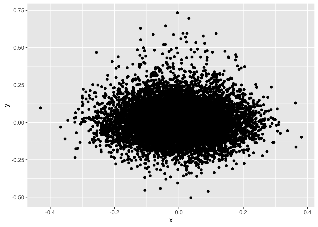
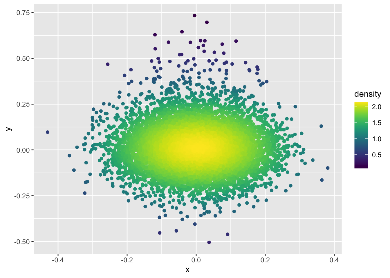
### Define the functio using kde2d# Get density of points in 2 dimensions.# @param x A numeric vector.# @param y A numeric vector.# @param n Create a square n by n grid to compute density.# @return The density within each square.get_density<-function(x, y, ...){dens<-MASS::kde2d(x, y, ...)ix<-findInterval(x, dens$x)iy<-findInterval(y, dens$y)ii<-cbind(ix, iy)return(dens$z[ii])}### Example dataset.seed(1)dat<-data.frame( x =c(rnorm(1e4, mean =0, sd =0.1),rnorm(1e3, mean =0, sd =0.1)), y =c(rnorm(1e4, mean =0, sd =0.1),rnorm(1e3, mean =0.1, sd =0.2)))### Split the plot into a 100 by 100 grid of squares and then color the points ### by the estimated density in each squaredat$density<-get_density(dat$x, dat$y, n =100)### Points are overplotted, so you can’t see the peak density:ggplot(dat)+geom_point(aes(x, y))
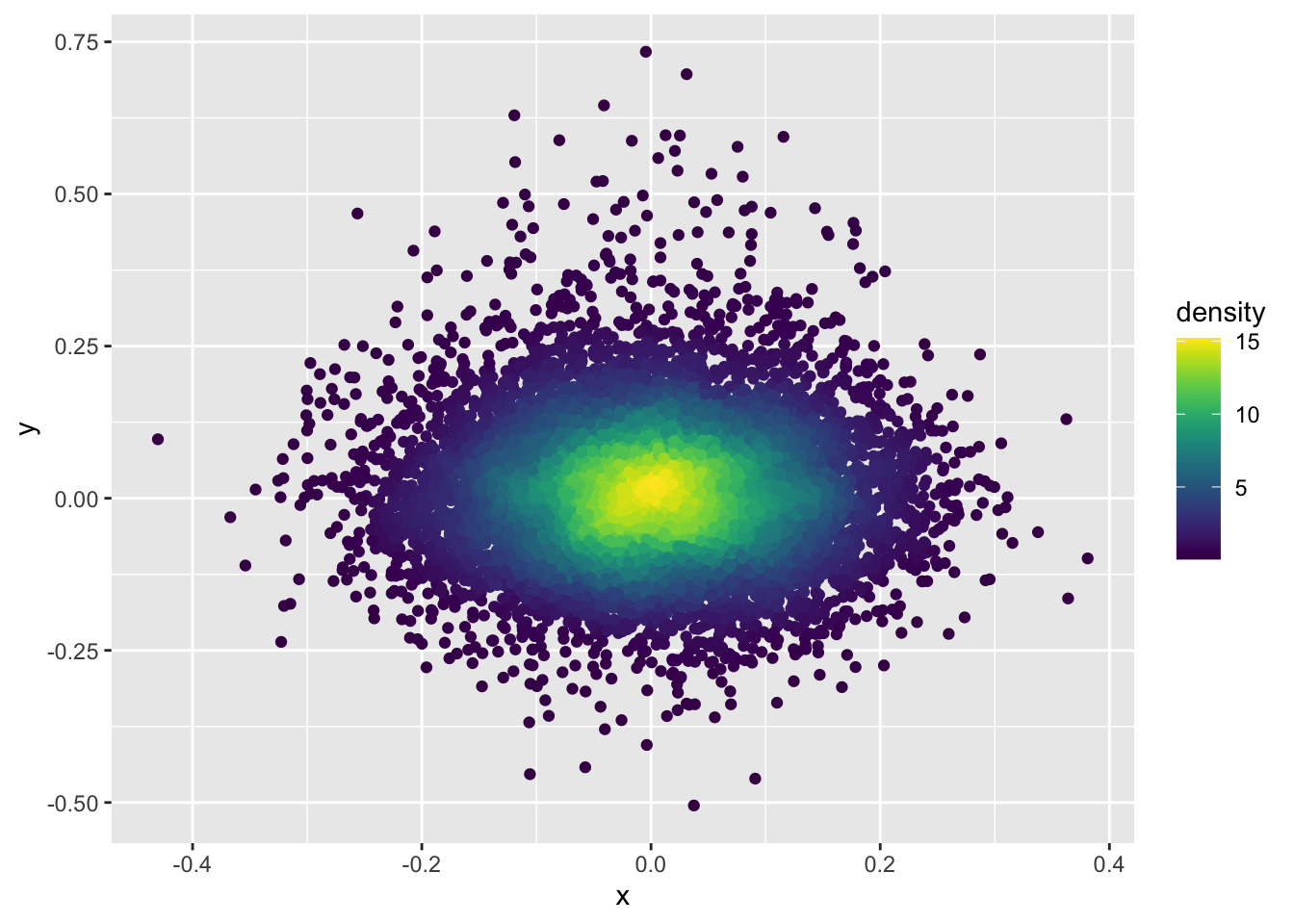
### set n = 15 (the squares in the grid are too big)dat$density<-get_density(dat$x, dat$y, n =15)ggplot(dat)+geom_point(aes(x, y, color =density))+scale_color_viridis()
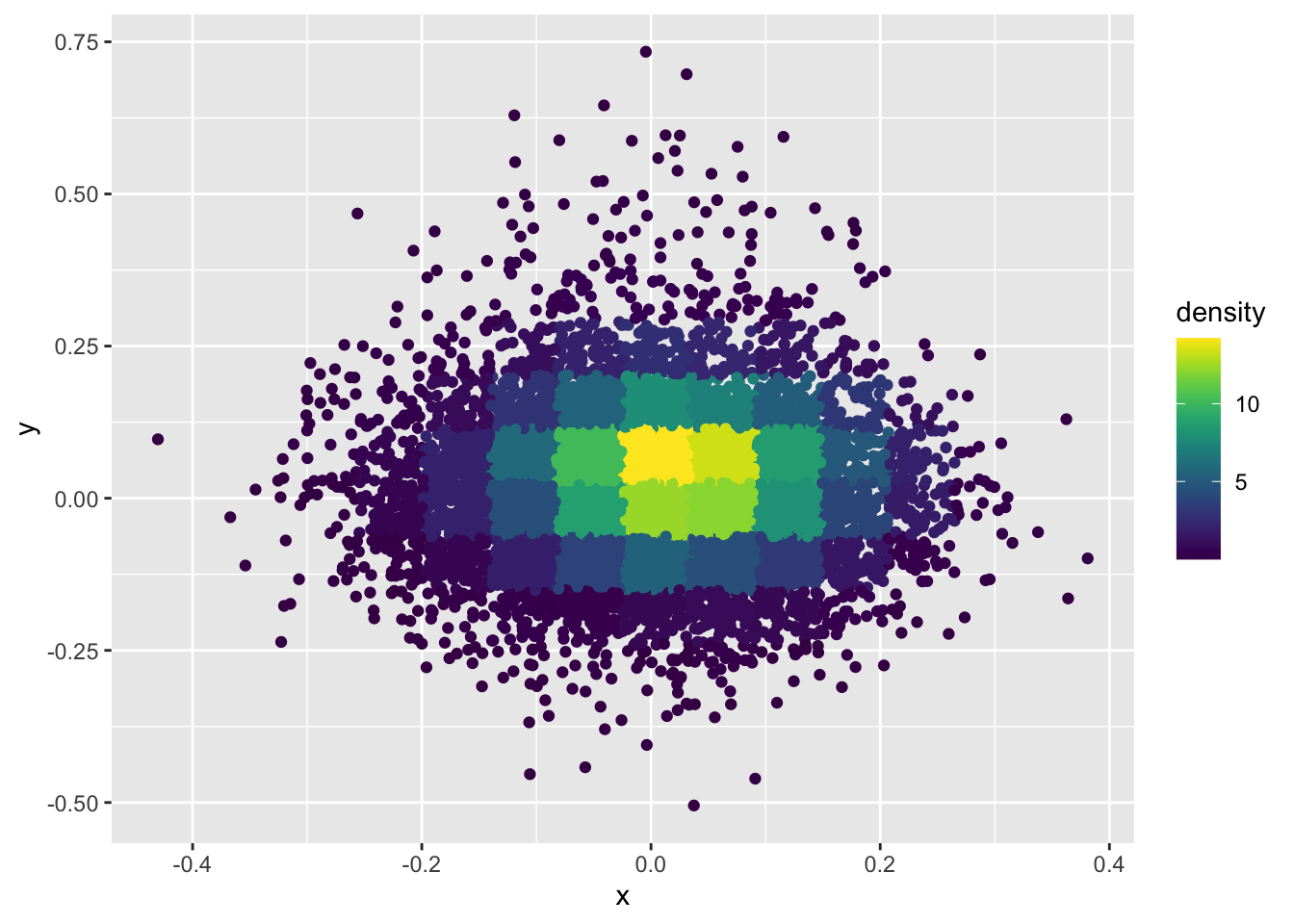
### And what if you modify the bandwidth of the normal kernel with h = c(1, 1)?dat$density<-get_density(dat$x, dat$y, h =c(1, 1), n =100)ggplot(dat)+geom_point(aes(x, y, color =density))+scale_color_viridis()
# Generate example dataset.seed(123)df<-data.frame(matrix(rnorm(1000), ncol=10))df$type<-sample(c("WT", "MUT/HET"), nrow(df), replace =TRUE)# Perform UMAPumap_result<-umap(df%>%select(-type))# Prepare data for plottingumap_df<-as.data.frame(umap_result$layout)colnames(umap_df)<-c("UMAP1", "UMAP2")umap_df$type<-df$type# Function to create density plots with customized legendplot_density<-function(data, title, color_low, color_high){ggplot(data, aes(x =UMAP1, y =UMAP2))+geom_density_2d_filled(aes(fill =after_stat(level)), bins =30)+# Ensure enough bins for continuous fillscale_fill_gradient(low =color_low, high =color_high, name ="Density", labels =c("Low", "High"))+theme_minimal()+labs(title =title)+theme( legend.position ="top", legend.title =element_text(size =10), legend.text =element_text(size =8), plot.title =element_text(hjust =0.5))+guides(fill =guide_colorbar(barwidth =7, barheight =1, title.position ="top", title.hjust =0.5, label.position ="bottom"))}# WT Density Plotwt_density_plot<-plot_density(umap_df%>%filter(type=="WT"), "WT density", "white", "blue")# Display the plotprint(wt_density_plot)