
How to compute and add p-values to basic ggplots using the rstatix and the ggpubr R packages.
- Perform pairwise mean comparisons and add the p-values onto basic box plots and bar plots.
- Display adjusted p-values and the significance levels onto the plots
- Format the p-value labels
- Specify manually the y position of p-value labels and shorten the width of the brackets
Note
- Compute easily statistical tests (
t_test()orwilcox_test()) using therstatixpackage - Auto-compute p-value label positions using the function
add_xy_position()[in rstatix package]. - Add the p-values to the plot using the function
stat_pvalue_manual()[in ggpubr package]. The following key options are illustrated in some of the examples:
- The option
bracket.nudge.yis used to move up or to move down the brackets. - The option
step.increaseis used to add more space between brackets. - The option
vjustis used to vertically adjust the position of the p-values labels
- In some situations, the p-value labels are partially hidden by the plot top border. In these cases, the ggplot2 function
scale_y_continuous(expand = expansion(mult = c(0, 0.1)))can be used to add more spaces between labels and the plot top border. The option mult = c(0, 0.1) indicates that 0% and 10% spaces are respectively added at the bottom and the top of the plot.
Basic Barplot or Boxplot with p-value
Comparing two means
# Transform `dose` into factor variable
df <- ToothGrowth
df$dose <- as.factor(df$dose)
head(df, 3)
##    len supp dose
## 1  4.2   VC  0.5
## 2 11.5   VC  0.5
## 3  7.3   VC  0.5

### statistical test to compare two independent groups

stat_test <- df %>%
    t_test(len ~ supp) %>%
    add_significance() %>%
    add_xy_position(x = "supp")

stat_test
## # A tibble: 1 × 13
##   .y.   group1 group2    n1    n2 statistic    df      p p.signif y.position
##   <chr> <chr>  <chr>  <int> <int>     <dbl> <dbl>  <dbl> <chr>         <dbl>
## 1 len   OJ     VC        30    30      1.92  55.3 0.0606 ns             34.3
## # ℹ 3 more variables: groups <named list>, xmin <dbl>, xmax <dbl>

p1 <- ggboxplot(df, x = "supp", y = "len", fill = "#00AFBB") +
    stat_pvalue_manual(stat_test, label = "p")

### Customize p-value labels using glue expression
p2 <- ggboxplot(df, x = "supp", y = "len", fill = "#00AFBB") +
    stat_pvalue_manual(
        stat_test,
        label = "T-test, p = {p}",
        vjust = -1, #vertically adjust the position of the p-values labels
        bracket.nudge.y = 1 # move up or to move down the brackets.
        ) +
    scale_y_continuous(expand = expansion(mult = c(0.05, 0.15)))
p1 + p2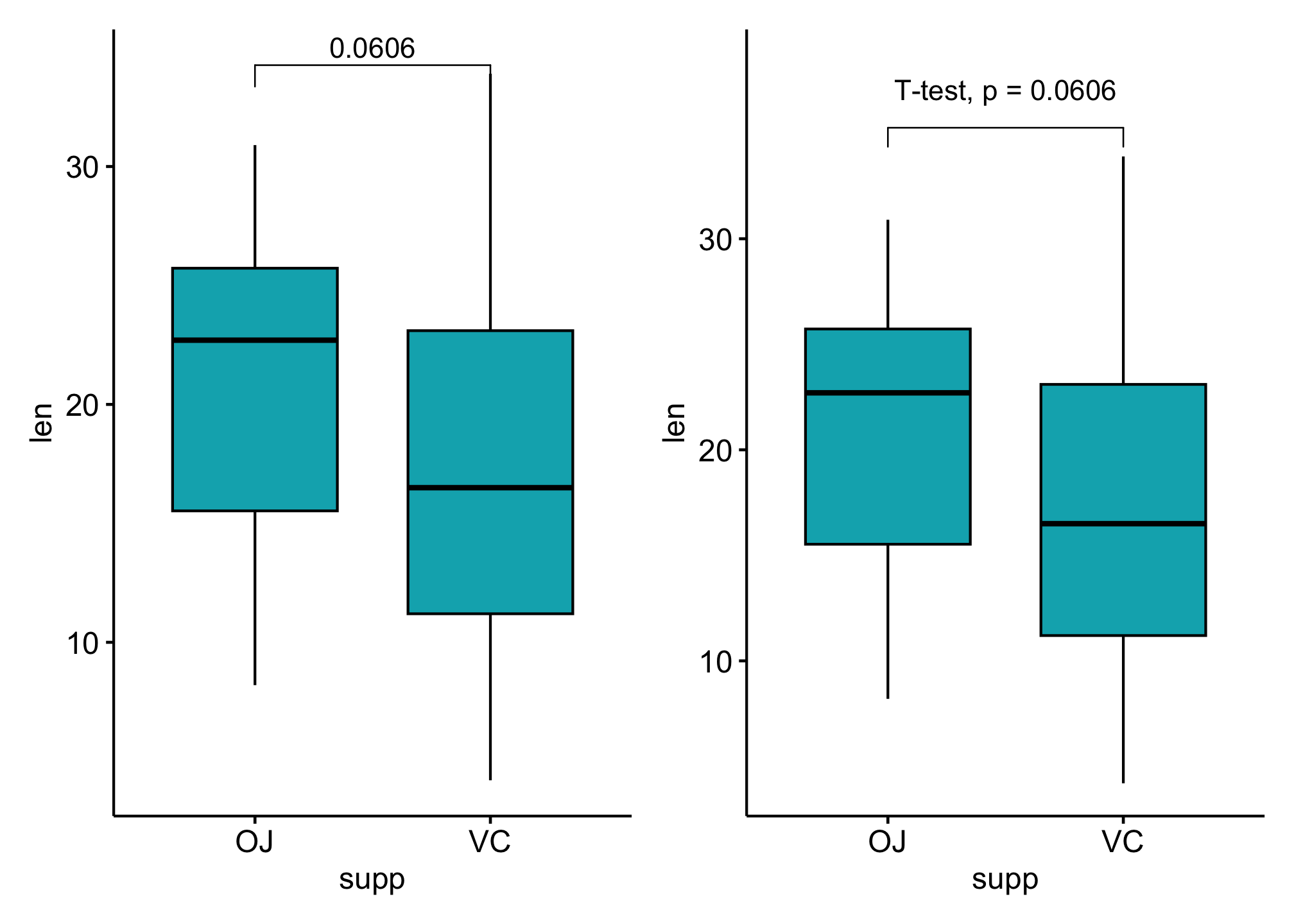
### grouped data
stat_test <- df %>%
    group_by(dose) %>%
    t_test(len ~ supp) %>%
    adjust_pvalue() %>%
    add_significance() %>%
    add_xy_position(x = "supp")

stat_test
## # A tibble: 3 × 15
##   dose  .y.   group1 group2    n1    n2 statistic    df       p   p.adj
##   <fct> <chr> <chr>  <chr>  <int> <int>     <dbl> <dbl>   <dbl>   <dbl>
## 1 0.5   len   OJ     VC        10    10    3.17    15.0 0.00636 0.0127
## 2 1     len   OJ     VC        10    10    4.03    15.4 0.00104 0.00312
## 3 2     len   OJ     VC        10    10   -0.0461  14.0 0.964   0.964
## # ℹ 5 more variables: p.adj.signif <chr>, y.position <dbl>,
## #   groups <named list>, xmin <dbl>, xmax <dbl>

ggboxplot(df,
    x = "supp", y = "len", fill = "#00AFBB",
    facet.by = "dose"
    ) +
    stat_pvalue_manual(stat_test, label = "p.adj") +
    scale_y_continuous(expand = expansion(mult = c(0.05, 0.10)))
### Show p-values if significant otherwise show ns
stat_test <- df %>%
    group_by(dose) %>%
    t_test(len ~ supp) %>%
    adjust_pvalue() %>%
    add_significance() %>%
    add_xy_position("supp")

stat_test$custom_label <- ifelse(stat_test$p.adj <= 0.05, stat_test$p.adj, "ns")

stat_test
## # A tibble: 3 × 16
##   dose  .y.   group1 group2    n1    n2 statistic    df       p   p.adj
##   <fct> <chr> <chr>  <chr>  <int> <int>     <dbl> <dbl>   <dbl>   <dbl>
## 1 0.5   len   OJ     VC        10    10    3.17    15.0 0.00636 0.0127
## 2 1     len   OJ     VC        10    10    4.03    15.4 0.00104 0.00312
## 3 2     len   OJ     VC        10    10   -0.0461  14.0 0.964   0.964
## # ℹ 6 more variables: p.adj.signif <chr>, y.position <dbl>,
## #   groups <named list>, xmin <dbl>, xmax <dbl>, custom_label <chr>

ggboxplot(df,
    x = "supp", y = "len", fill = "#00AFBB",
    facet.by = "dose"
    ) +
    stat_pvalue_manual(stat_test, label = "custom_label") +
    scale_y_continuous(expand = expansion(mult = c(0.05, 0.10)))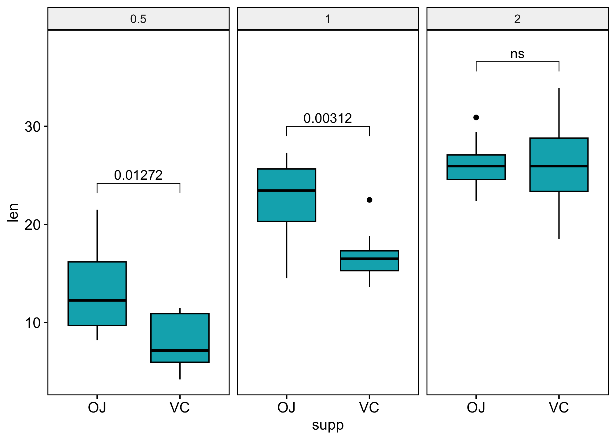
### Compare paired samples
# Statistical test
stat_test <- df %>%
  t_test(len ~ supp, paired = TRUE) %>%
  add_significance() %>%
  add_xy_position(x = "supp")

### boxplot with pvalue
p1 <- ggpaired(df, x = "supp", y = "len", fill = "#E7B800",
                 line.color = "gray", line.size = 0.4)+
                 stat_pvalue_manual(stat_test, label = "p.signif")+
                 scale_y_continuous(expand = expansion(mult = c(0.05, 0.10)))

### combined with significane level
p2 <- ggpaired(df,
    x = "supp", y = "len", fill = "#E7B800",
    line.color = "gray", line.size = 0.4
) +
    stat_pvalue_manual(stat_test, label = "{p}{p.signif}") +
    scale_y_continuous(expand = expansion(mult = c(0.05, 0.10)))

p1 + p2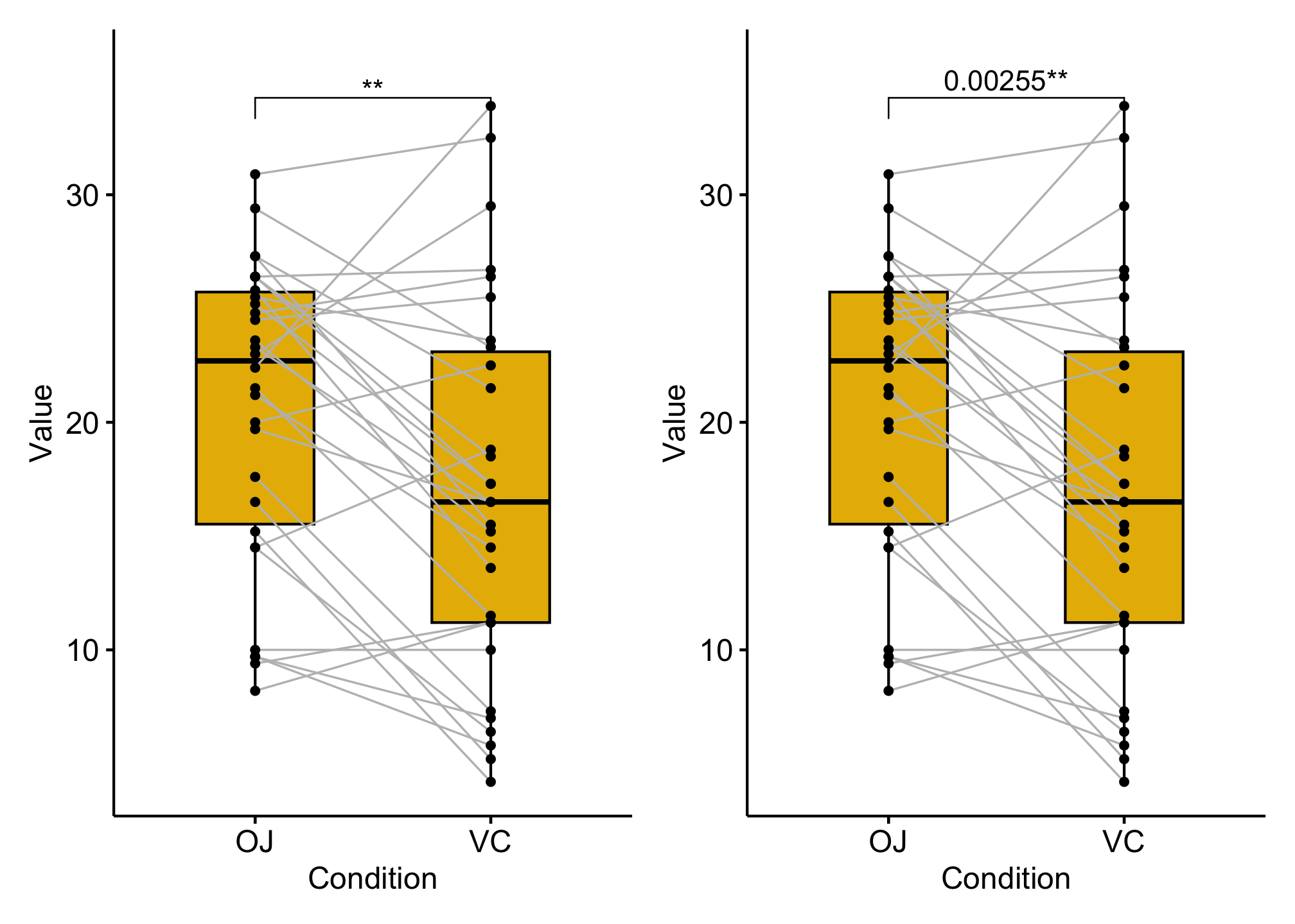
Pairwise comparisons
### boxplot
stat_test <- df %>% t_test(len ~ dose) %>%
    add_xy_position(x = "dose")

bxp <- ggboxplot(df,
    x = "dose", y = "len", fill = "dose",
    palette = c("#00AFBB", "#E7B800", "#FC4E07") # Box plots
    ) +
    stat_pvalue_manual(
      stat_test,
      label = "p.adj.signif",
      tip.length = 0.01
)

### Specify manually the y position of p-value labels and shorten the width of the brackets
bxp_man <- bxp +
  stat_pvalue_manual(
    stat_test, label = "p.adj.signif", tip.length = 0.01,
    y.position = c(35, 40, 35), bracket.shorten = 0.05
    )

### Bar plot
stat_test <- df %>%
    t_test(len ~ dose) %>%
    add_xy_position(fun = "mean_sd", x = "dose")

# Bar plots showing mean +/- SD
bp <- ggbarplot(df,
        x = "dose", y = "len", add = "mean_sd", fill = "dose",
        palette = c("#00AFBB", "#E7B800", "#FC4E07")
    ) +
    stat_pvalue_manual(
        stat_test,
        label = "p.adj.signif",
        tip.length = 0.01
        )

bxp + bxp_man + bp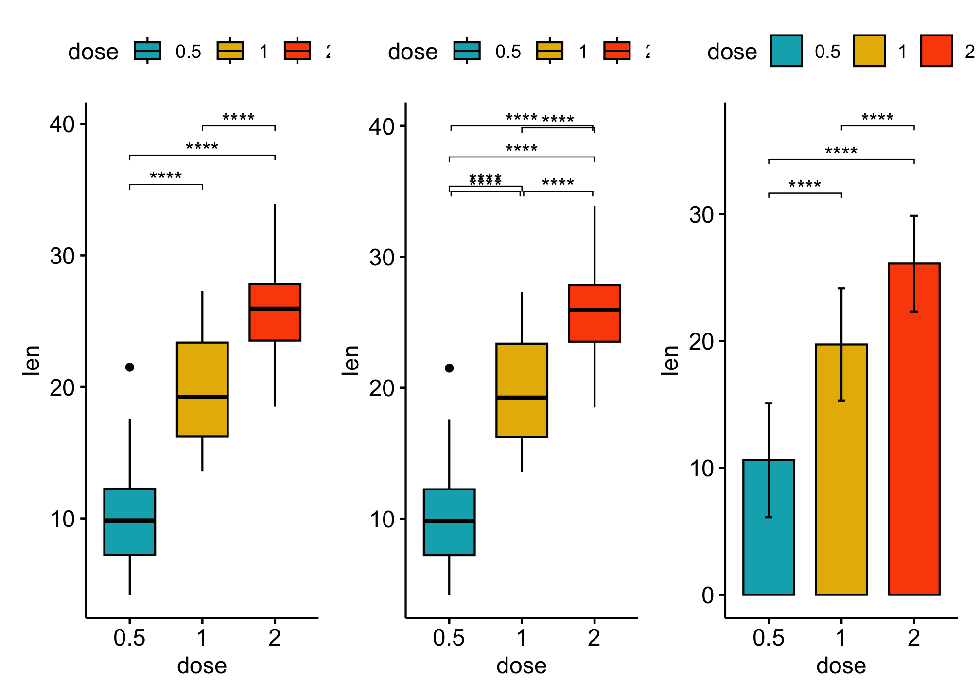
Comparsions against reference groups
stat_test <- df %>%
    t_test(len ~ dose, ref.group = "0.5") %>%
    add_xy_position(x = "dose")

bxp <- ggboxplot(df,
    x = "dose", y = "len", fill = "dose",
    palette = c("#00AFBB", "#E7B800", "#FC4E07") # Box plots
    ) +
    stat_pvalue_manual(
      stat_test,
      label = "p.adj.signif",
      tip.length = 0.01
)

bp <- ggbarplot(df,
        x = "dose", y = "len", add = "mean_sd", fill = "dose",
        palette = c("#00AFBB", "#E7B800", "#FC4E07")
    ) +
    stat_pvalue_manual(
        stat_test,
        label = "p.adj.signif",
        tip.length = 0.01
        )

bxp + bp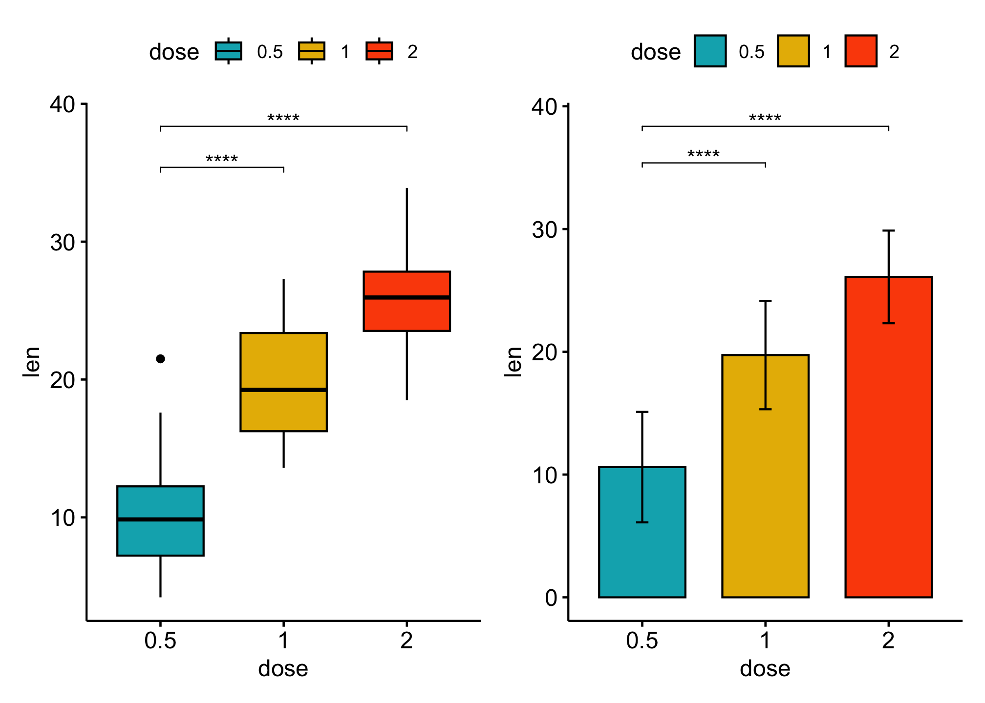
Comparsions against all (basemean)
stat_test <- df %>%
    t_test(len ~ dose, ref.group = "all") %>%
    add_xy_position(x = "dose")

bxp <- ggboxplot(df,
    x = "dose", y = "len", fill = "dose",
    palette = c("#00AFBB", "#E7B800", "#FC4E07") # Box plots
) +
    stat_pvalue_manual(
        stat_test,
        label = "p.adj.signif",
        y.position = 35
    )

stat_test <- df %>%
    t_test(len ~ dose, ref.group = "all") %>%
    add_xy_position(fun = "mean_sd", x = "dose")

bp <- ggbarplot(df,
    x = "dose", y = "len", add = "mean_sd", fill = "dose",
    palette = c("#00AFBB", "#E7B800", "#FC4E07")
) +
    stat_pvalue_manual(
        stat_test,
        label = "p.adj.signif"

    )

bxp + bp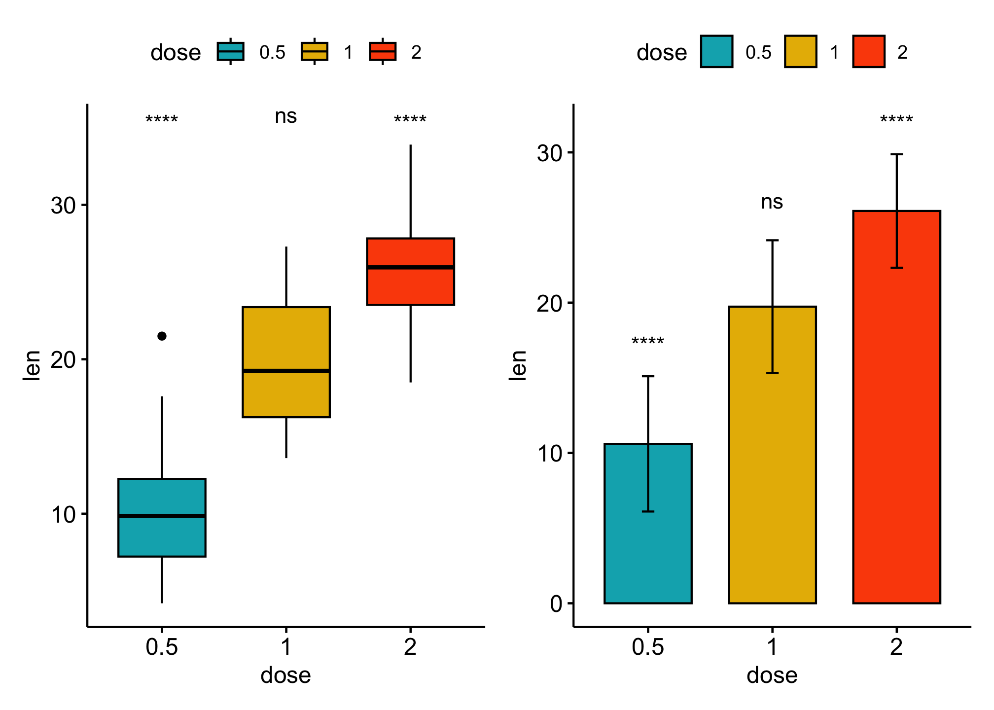
Add p-values to horizontal ggplots
# Transform `dose` into factor variable
df <- ToothGrowth
df$dose <- as.factor(df$dose)

head(df, 3)
##    len supp dose
## 1  4.2   VC  0.5
## 2 11.5   VC  0.5
## 3  7.3   VC  0.5

stat_test <- df %>%
    t_test(len ~ dose) %>%
    add_significance() %>%
    add_xy_position(x = "dose")

stat_test
## # A tibble: 3 × 14
##   .y.   group1 group2    n1    n2 statistic    df        p    p.adj p.adj.signif
##   <chr> <chr>  <chr>  <int> <int>     <dbl> <dbl>    <dbl>    <dbl> <chr>
## 1 len   0.5    1         20    20     -6.48  38.0 1.27e- 7 2.54e- 7 ****
## 2 len   0.5    2         20    20    -11.8   36.9 4.40e-14 1.32e-13 ****
## 3 len   1      2         20    20     -4.90  37.1 1.91e- 5 1.91e- 5 ****
## # ℹ 4 more variables: y.position <dbl>, groups <named list>, xmin <dbl>,
## #   xmax <dbl>

# Box plots
ggboxplot(df,
    x = "dose", y = "len", fill = "dose",
    palette = c("#00AFBB", "#E7B800", "#FC4E07")
) +
    stat_pvalue_manual(
        stat_test,
        # use the adjusted p-value significance levels as labels
        label = "p.adj.signif", tip.length = 0.01,
        coord.flip = TRUE
    ) +
    coord_flip()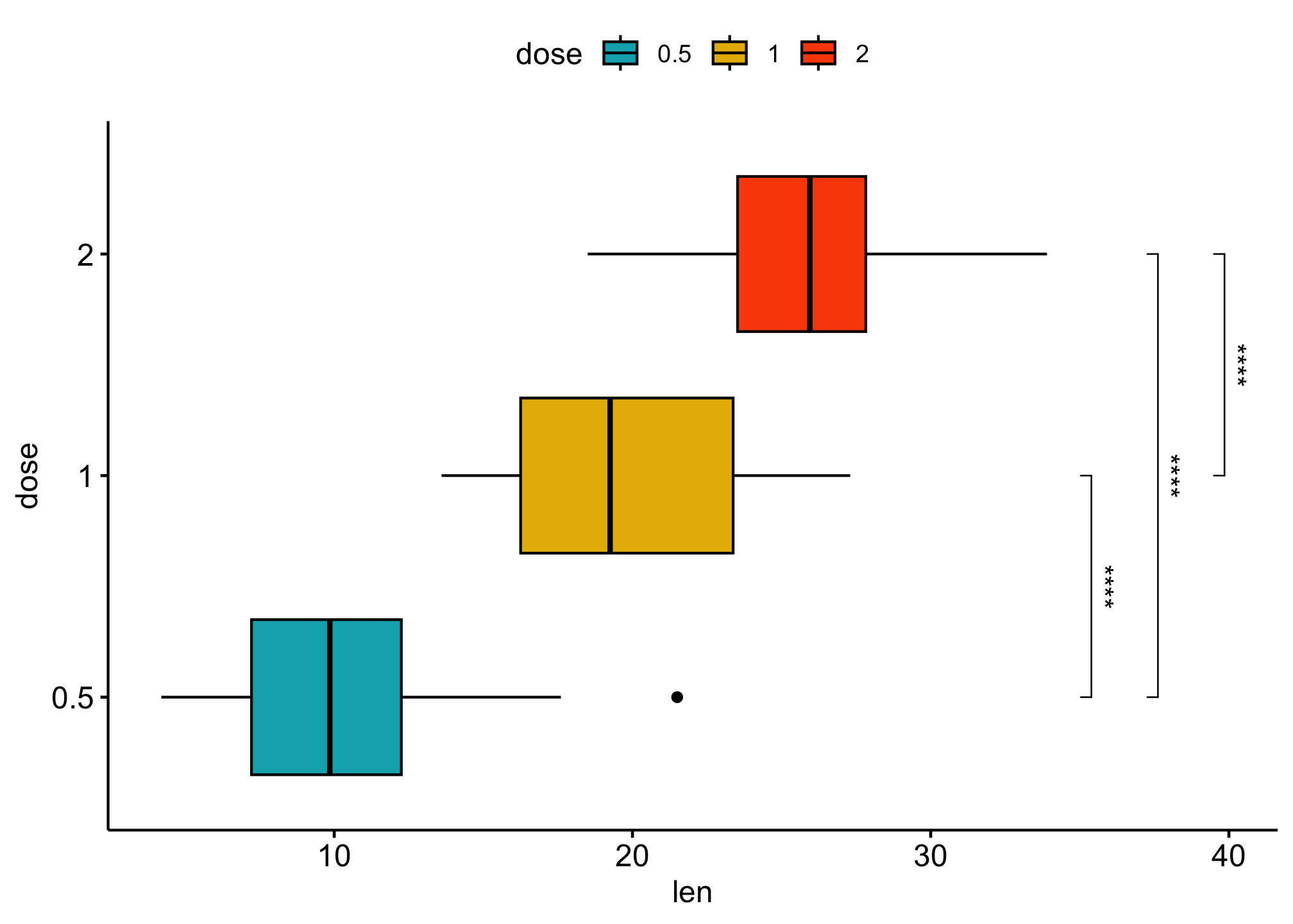
ggboxplot(df,
    x = "dose", y = "len", fill = "dose",
    palette = c("#00AFBB", "#E7B800", "#FC4E07")
) +
    stat_pvalue_manual(
        stat_test,
        ### use adjusted p-values as labels
        label = "p.adj", tip.length = 0.01,
        coord.flip = TRUE
    ) +
    coord_flip()
Reference
- How to Add P-Values onto Basic GGPLOTS
- How to Add P-Values onto Horizontal GGPLOTS
- How to Add P-Values onto a Grouped GGPLOT using the GGPUBR R Package
- How to Add P-values to GGPLOT Facets
- Add P-values to GGPLOT Facets with Different Scales
- GGPUBR: How to Add P-Values Generated Elsewhere to a GGPLOT
- GGPLOT Facet: How to Add Space Between Labels on the Top of the Chart and the Plot Border