
pacman::p_load(
    tidyverse,
    ggsci,
    ggridges,
    ggtext,
    ggh4x,
    gapminder,
    here
)Visualizing changes in distributions over time or space nicely usning ggrigges.
### subset data
df <- gapminder %>% filter(continent %in% c("Asia","Europe"))
df
## # A tibble: 756 × 6
##    country     continent  year lifeExp      pop gdpPercap
##    <fct>       <fct>     <int>   <dbl>    <int>     <dbl>
##  1 Afghanistan Asia       1952    28.8  8425333      779.
##  2 Afghanistan Asia       1957    30.3  9240934      821.
##  3 Afghanistan Asia       1962    32.0 10267083      853.
##  4 Afghanistan Asia       1967    34.0 11537966      836.
##  5 Afghanistan Asia       1972    36.1 13079460      740.
##  6 Afghanistan Asia       1977    38.4 14880372      786.
##  7 Afghanistan Asia       1982    39.9 12881816      978.
##  8 Afghanistan Asia       1987    40.8 13867957      852.
##  9 Afghanistan Asia       1992    41.7 16317921      649.
## 10 Afghanistan Asia       1997    41.8 22227415      635.
## # ℹ 746 more rowsggplot(df, aes(y = country, x = lifeExp, fill = continent)) +
geom_density_ridges(size = .15, color = "black") +
scale_x_continuous(
### converse x axis
trans = "log10", expand = c(0, 0),
labels = scales::comma_format(suffix = "k", scale = 1e-4)
) +
scale_y_discrete(expand = c(0, 0)) +
scale_fill_futurama(alpha = .95) +
### facet continent
facet_wrap(vars(continent), scales = "free_y") +
coord_cartesian(clip = "off") +
theme_minimal() +
theme(
legend.position = "bottom",
legend.justification = "right",
axis.title.x = element_text(margin = margin(t = 10), color = "black"),
axis.title.y = element_blank(),
axis.text.x = element_text(size = 8, color = "black"),
axis.text.y = element_text(face = "bold", color = "black"),
panel.grid.minor = element_blank(),
panel.grid.major.x = element_line(
linewidth = .3, linetype = "dashed",
color = "grey75"
),
panel.grid.major.y = element_blank(),
axis.ticks.x = element_line(linewidth = .3, color = "black"),
panel.spacing = unit(1, "lines"),
strip.text = element_text(
face = "bold", margin = margin(b = 10),
color = "black", size = 12
),
plot.background = element_rect(fill = "white", color = NA),
plot.margin = margin(20, 20, 20, 20),
legend.title = element_blank()
) +
guides(fill = guide_legend(
override.aes = list(color = NA),
label.theme = element_text(color = "white", size = 8)
))
## Picking joint bandwidth of 0.035
## Picking joint bandwidth of 0.0125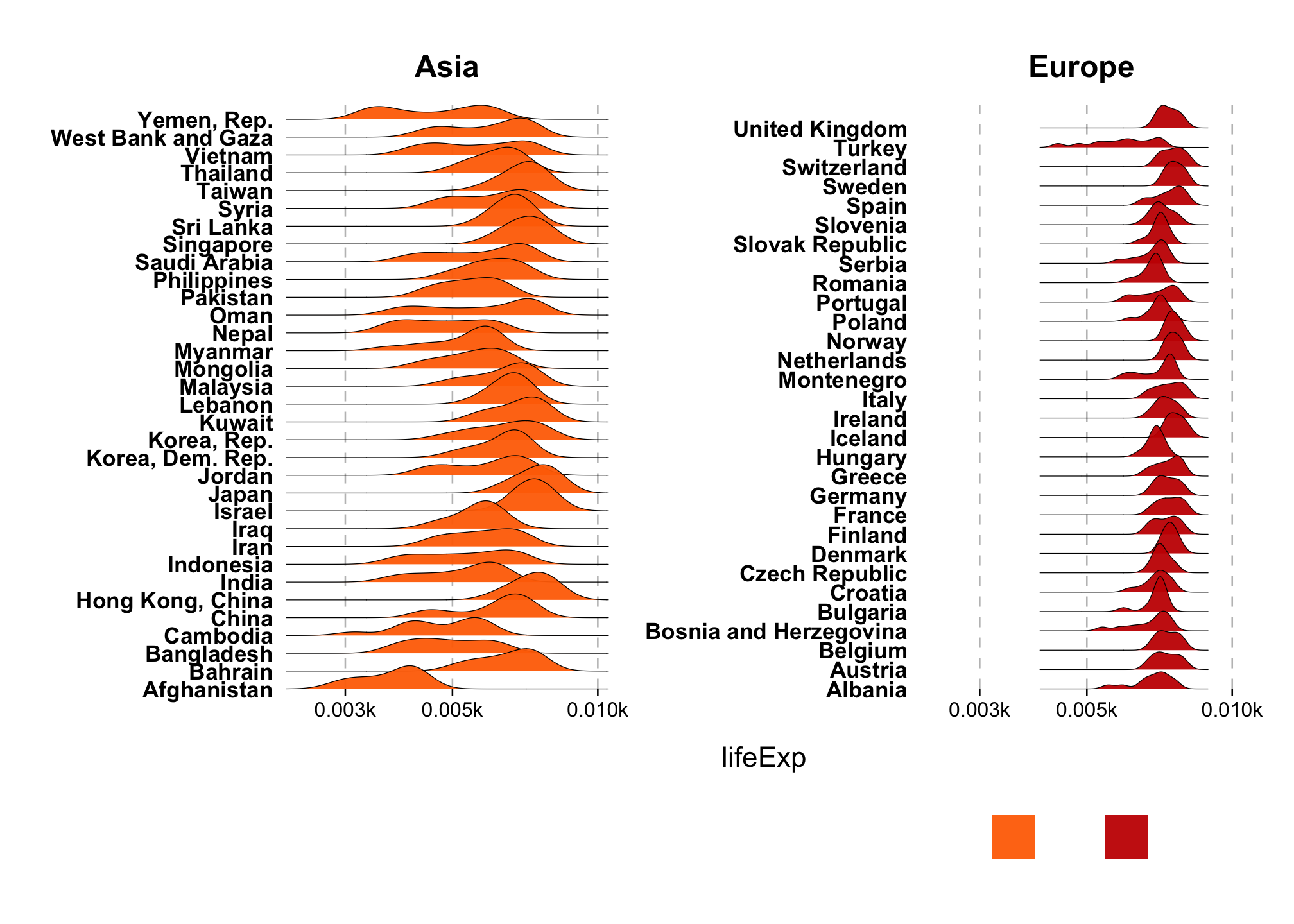
# ggsave(
#     here("blog", "2023", "03", "08", "plot.png")
#     # width = 6,
#     # height = 3.8
#     # units = "in",
#     # type = "cairo"
# )